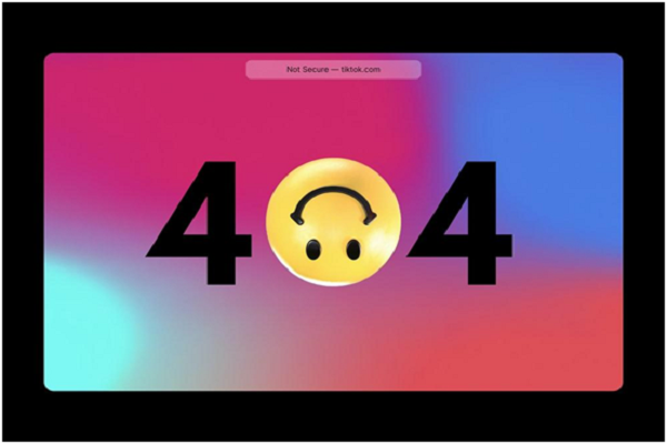
You might sometimes see a 404 error on the website you are browsing. Maybe the page has a broken link or has been deleted. Other times, you might enter the wrong URL, which directs you to a 404 error. Don’t panic; this message only means that the page is unavailable.
Usually, these mistakes can be controlled by website owners. For instance, the broken links on the site or removing the pages. But other errors are because of the users, which are outside the owner’s control.
As a website owner, you can fix the errors within your control to avoid affecting your SEO performance. While those you can’t fix can be handled by introducing a 404 error page. Experts advise that web design for SaaS should have customized pages that add value and retain brand loyalty. It offers a smooth user experience that will not frustrate users to abandon your site.
This article gives you an insight on how to design a unique 404 error page that enhances usability.
Be Creative
Avoid using the basic page, which is usually a default setting. This page is not appealing and always puts off the user. It is too plain and forces you to abandon the site immediately.
To make your page trendier, you can be creative and design a customized page with more information. Be persuasive and encourage the user to explore other sections through a link that leads them deep into the sales funnel.
Create HTTP 404 Server Status Code
The main aim of a 404-page error is to let users know that the page is unavailable. It produces a status code called a 404 HTTP server error.
Many people might think that designing a 404 page is similar to developing a webpage with an error message on the URL. However, this page is a soft 404, which sends the message to the search engines. When users see this, they immediately move away to another site because it shows an error.
Therefore, developing soft 404 pages are not a good design practice because they confuse the users and meddle with the SEO performance. So, you need to create an appropriate 404 error page that returns a valid HTTP status code. It should have the relevant URL to allow the owner to track and fix it from the server.
Show Concern
Nothing is more frustrating than opening a website, and you can’t access the desired information. Instead, you can see technical jargon and codes that you don’t understand. It gets worse if the 404 page is shallow without any explanations.
An excellent page should at least have a brief and clear explanation informing the visitors about the cause of the error. You can go ahead and apologize for the inconvenience and assure the users that you will resolve the issue in due time. This is one way of showing concern to the visitors and that your priority is to offer a good user experience. The users will understand the situation and continue browsing other content rather than leaving a bad impression.
Prompt Visitors To Search
People often visit specific websites to get detailed information to satisfy their needs. It could be health-related, school research, or an e-commerce site.
If your website does not have the content users are looking for, you can prompt them to search for the content they want. Providing a search bar allows visitors to get the relevant information quickly. You can incorporate the search bar on the 404 page. After the user reads the error explanation, they might opt to search for what they want.
It helps you capture the users’ interest to continue surfing the site.
Generate Sales
Most users visiting an e-commerce site want to purchase an item. The chances of visitors leaving the site are high when they encounter an error. If you are an e-commerce website owner, you have the potential to turn the 404 errors into impressive sales.
Therefore, you can use the 404 page as a promotional tool. You can add new product releases, heft discount offers, and other promotions. When visitors encounter a page error, they will be interested in checking out the available offers instead of abandoning the task. This is an insightful tip to help you turn errors into substantial sales.
Optimize For Leads
If your website or app provides services to users, you can optimize the 404 pages. It is possible by introducing a CTA (call-to-action) button, for instance, to subscribe or to accept a free trial. You can also add a form where users can fill in their information.
This subtle strategy can help website owners generate more leads. Instead of having a plain 404 page, the CTAs will lead the users to get valuable information without feeling pressured. You can also offer a free subscription to your company newsletter.
Also Read: 4 Thank-You Page Examples to Boost Visitor Experience
Lead Visitors Into The Site
Another way to maximize the 404 page is to add valuable links. You can lead visitors to your website using the links. For instance, if you browse an e-commerce site to buy an item, you can add similar links to the product.
The primary purpose of incorporating links is to encourage users to browse your website further for more content. It mitigates the negative impressions that 404 pages often cause. However, do not add many links on the page. The aim is to entice potential customers, not overwhelm them with links.
Do it Right!
It is essential to have an impressive 404 page like any other web page design. You need to customize the page to represent your brand professionally. Use creative content to lead your visitors in the right direction, rather than having a negative impression of your site. You might enjoy high leads and increased revenue from an error page if you do it right.


No comments:
Post a Comment