Most SaaS companies focus on email marketing using free marketing automation tools – while that serves them well, some areas remain untapped.
When you make a purchase, the website takes you to a thank you page. It is the last step on the customer buyer journey – or so you would think. Most people do not realize the thank you page can initiate new buyer journeys and consumer relationships if you want!
They could be fascinated by a similar product line they recently purchased. Perhaps they'll appreciate the new article you've written in your publication. These are all chances to keep the discussion going with your consumers and grow your connection.
Do not lose out on this golden opportunity to communicate with your clients and start strategizing about how you can transform your thank you page to avail maximum leads. Here are a few examples to give you an idea:
Ask for referrals
Who do you trust more? A company vouching for their products' benefits or a friend sharing their experience. After a customer has purchased a product, add a 'refer to a friend' call to action on the landing page. You might argue that why would anyone want to go out of their way and invest time.
If someone is genuinely satisfied with their journey, they will be willing to spend the extra 2 minutes referring your company to their friends.
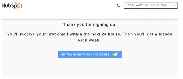
It also makes them feel a part of the community. They feel empowered and honored that you trusted them to be a part of your journey. See how Hubspot uses this tactic, making their thank you page so much more effective.
However, not everyone would want to spend time or energy recommending your product to their friends. This can be solved by attaching an incentive to this CTA. For every referral, your customer can get discounts or gifts.
Ask for feedback
Employee input is necessary for making company decisions, but a customer's opinion is indispensable. No one can critique your work better than the one using it. Add a survey or a small questionnaire below
your thank you note.
Look at this example of the Apple Store’s thank you page.
This will serve a dual purpose. Apple gets an insight into client objectives and pain spots, which allows them to develop focused marketing communications. And the client feels important and heard. Even if they were dissatisfied at some point, conveying their problem to the company will calm them down.
With the correct SaaS email marketing templates and automation tools, ensure that you immediately write back to them. Craft a generic yet customized message that informs them that the company has received their response can do wonders. The actual answer to their message can come later!
Inform about new products
Naturally, if a customer has just made a purchase, that means they already trust your brand at some level. Convincing them for a new product is easier and less expensive than getting new prospects on board.
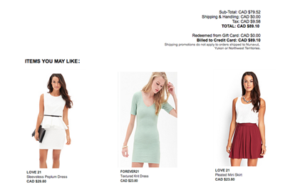
A thank you page is, therefore, an ideal spot to cross-promote items, especially ones that are comparable to the ones your consumer recently purchased. In the example below, Forever 21 handles this by displaying more things that the consumer might like at the footer of their check-out page. You may also advertise your most trending items.
The more times you can persuade a consumer to buy something else, the higher their lifetime value. This is because recurrent clients have established trust, resulting in a long-term relationship.
Discount offers
All customers like to feel important and valued. A great way to do this is by offering discounts on the thank you page. Unlike seasonal sales and generic discounts, rewarding consumers who have just purchased an item with discount codes can go a long way.
Some people may argue that if a customer just made a purchase, they may not want to buy another product immediately. For this you can do two things:
1. Make the discount codes applicable on similar products to lure the customer. For example, if the customer just bought an air pod, offering a discount on an air pod cover is a brilliant move.
2. Make the discount time-bound. For example, offer a code that is valid for the next 24 hours.
By providing customers with a timely and relevant offer, they are more likely to take advantage of the discount and make another purchase right away. Take a look at the Shutterfly thank you page:
Shutterfly, in this example, uses a discount offer to appreciate the customer and encourage them to remain engaged with them in the future.
Conclusion
These are all excellent ideas that you can employ to improve your consumer engagement. However, remember that you do not overwhelm the client with multiple CTA's. That can result in unnecessary confusion leading to the client closing the tab completely.
Use SaaS marketing automation to judge which idea delivers maximum leads and returns and choose what works best!


No comments:
Post a Comment