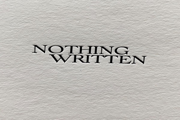
Good content is essential to produce a good website, but without good web design, it might not be enough. Thinking that web design is merely about color and images is the reason why a lot of websites, both personal and commercial, fail. They tend to leave out one of the major aspects of web design, called typography, which houses its key element: Fonts.
Typography in web design is focused on making website text readable and generally presentable to visitors. The goal is to style and arrange letters, numbers and symbols in a clear, conceivable and consistent way, thus effectively conveying the website owner’s message. Right typography unites and harmonizes all textual content inside the website, allowing them to work proficiently with the photos and the videos in it.
Fonts play a pivotal role in typography because they are inevitably used on the exact text that people see and read. Emotions are relayed to site visitors through them. They can say a lot of things about the business and the personality of the owners behind it. Because of these, they set the voice and mood of your brand. This is why using the right fonts is paramount. They can make or break the effectiveness of your web design and of your website as a whole.
Are you planning to launch a website for your business or personal blog? Or are you currently contemplating on updating your web design to enhance it? Great, you’re on the piece you exactly need right now! Here are 5 typography tips in choosing the best fonts for your web design.
1 – Match the font to the tone of your brand.
As mentioned earlier, fonts establish how your brand sounds, even without audio content. While you’re reading this article, you cannot actually hear the voice of the writer. Instead, you read with a voice that the fonts suggest, alongside the choice of words or the genre of the topic. It’s the same thing for your site visitors. Fonts build tonality in your brand. They give an impression of what attitude and character your brand carries.
Knowing these, you have to match the fonts of your website to the tone you intend your brand to have. If you’re a health and fitness brand that aims to encourage people into living a more wholesome lifestyle, then your fonts should be inviting activity and action. If you’re a gadget brand, try incorporating tech-feeling fonts. If you’re a pet essentials brand, friendly and snuggly-looking fonts would be ideal.
Elegant, simple, cartoonized, feminine, bold, minimalist, manly or homely might be the aura you want your site to exude. You can find various font styles under these and more categories. Just make sure that the fonts you choose align with how you want to be heard through your site, without needing to speak vocally.
2 - Use fonts that don’t disguise text under extreme styles.
Resist the temptation of wanting to use fonts that are too decorative or ‘cool’ to the point of disregarding the readability of your site text. Of course, attractiveness is important when picking a font style, but never let legibility suffer!
Utilize fonts that are comprehensible, giving readers a hassle-free time to browse, read and understand your content. Don’t use fonts that look like animals, food or people, especially articles like the one you’re reading now. Often, they disguise text under extreme styles and patterns. They are made for brands that mostly aim at design and/or entertainment, like in child-centered and gaming websites.
3 - Minimize the number of fonts.
As much as possible, minimize the number of fonts you use in your website. You don’t really need a lot, so just display the best one you need.
Meanwhile, if you need to use multiple fonts, see to it that they are compatible with each other. They should neither be awkward nor overpowering each other. They should not result in an unsightly interface. All these fonts must work hand in hand for a progressive web design.
Look into font families to see the variations of a single font. They lessen your worries when choosing more than one font because they have all font family members under one location.
4 – Choose fonts with both capital and small letters.
An all-capitalized sentence expresses a feel that is dissimilar to its opposite, a small-lettered sentence. When choosing fonts, make sure they have both capital and small letter equivalence because you cannot just go with either of the two of them; you need both. Needless to say, capital letters are for starting sentences and often for headings and titles. On the other hand, small letters are necessary for website text in general, for write-ups, for icons, for buttons, for menus and many more! Both are operative in their own distinct purposes.
5 - Use fonts that are efficient for text-heavy web pages.
If your website is text-heavy, don’t complicate things; use fonts that are simple and straightforward. Your aim is for people to read your content and to keep reading it because they understand it. Fonts that are crystal clear must be your pick! Don’t give your readers a hard time, so they will lend you their precious time.
FONTS IN WEB DESIGN
With fonts, you communicate with your audience. Make sure you do so in the best way possible and in the exact way you wish to. Ask for help from a reliable web design agency if you want to know more and learn fast about growing a website that’s advantageous in and out!
ABOUT THE AUTHOR:
Nicole Ann Pore is a writer, an events host and a voice over artist. She finds quality and well-researched writing as a worthwhile avenue to enlighten and delight others about things that matter. Giving all the glory to God, Nicole graduated Cum Laude from De La Salle University Manila, Philippines with a Bachelor’s Degree in Communication Arts.


No comments:
Post a Comment